As a self-initiated project, I reviewed the landing page of PaulCamper, a van rental platform, with a focus on accessibility, and proposed improvements to enhance the user experience. Accessibility is something I care deeply about—in past roles, I’ve often taken the lead in driving accessibility improvements and raising awareness within my teams.
UX

UI
Accessibility
See live site

I aimed to stay true to the existing brand identity while suggesting meaningful improvements. I proposed changes like reworking the layout of the hero section and footer, cleaning up the color styles, and testing key elements to meet contrast and readability standards.
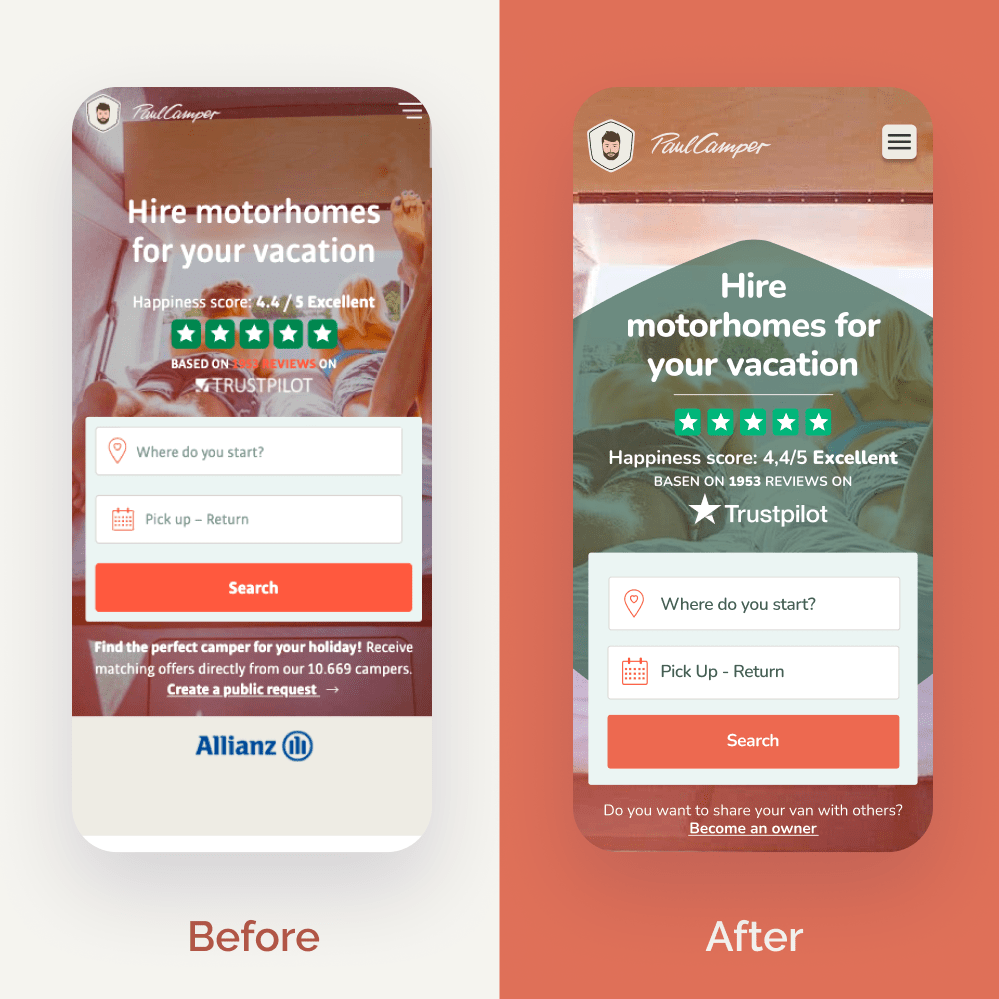
I improved the accessibility of this section by adjusting the form field colours to meet contrast standards and ensuring that text stayed readable by avoiding overlap with background images.

Chaotic text layouts can make information harder to process, especially for users with neurodivergence or visual impairments. I reorganized the footer to create a clearer, more accessible structure.
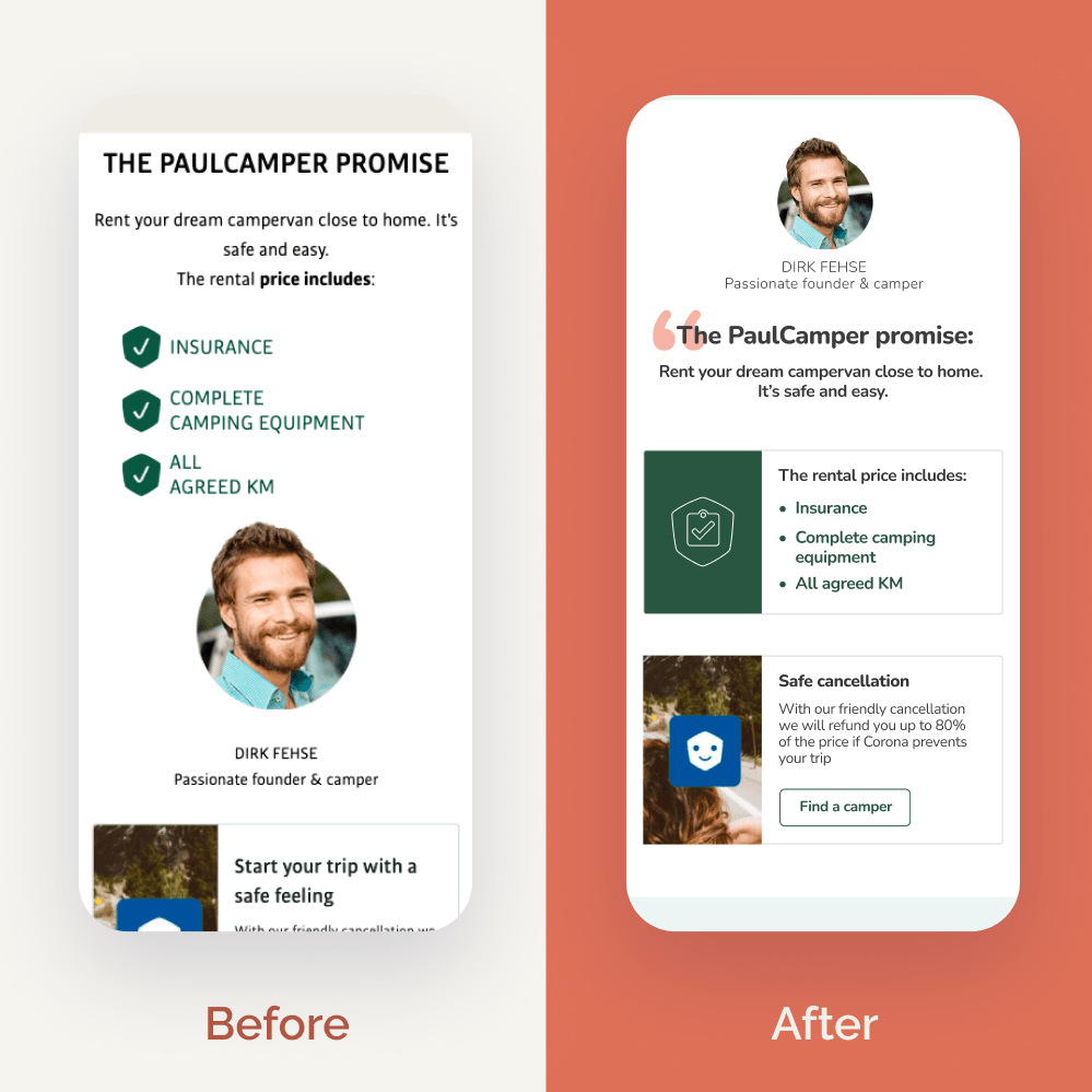
Using multiple font sizes and all-caps text can negatively impact accessibility. I proposed a cleaner, more structured typographic approach that highlights key content without compromising readability.

In addition to the accessibility improvements, I suggested several other enhancements—like visually highlighting the newsletter signup, unifying the image styles, and making the contact information easier to find.